Pagol platform
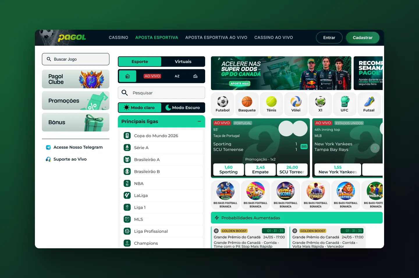
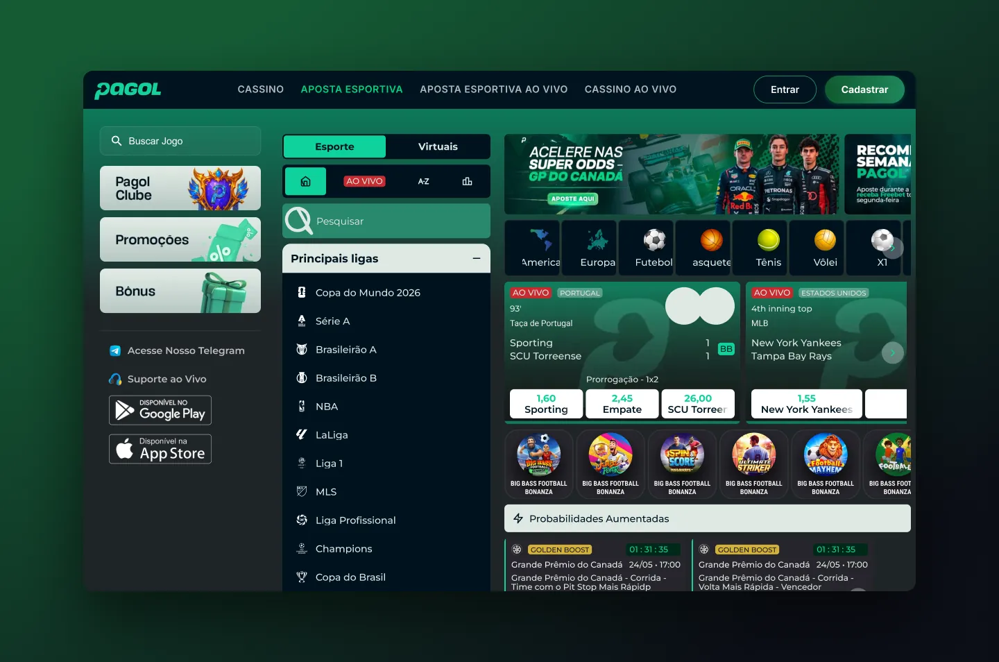
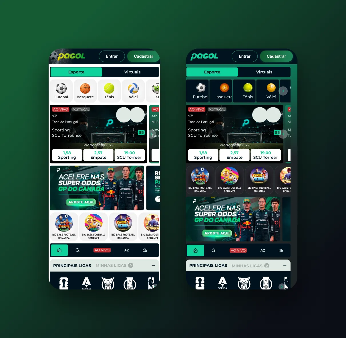
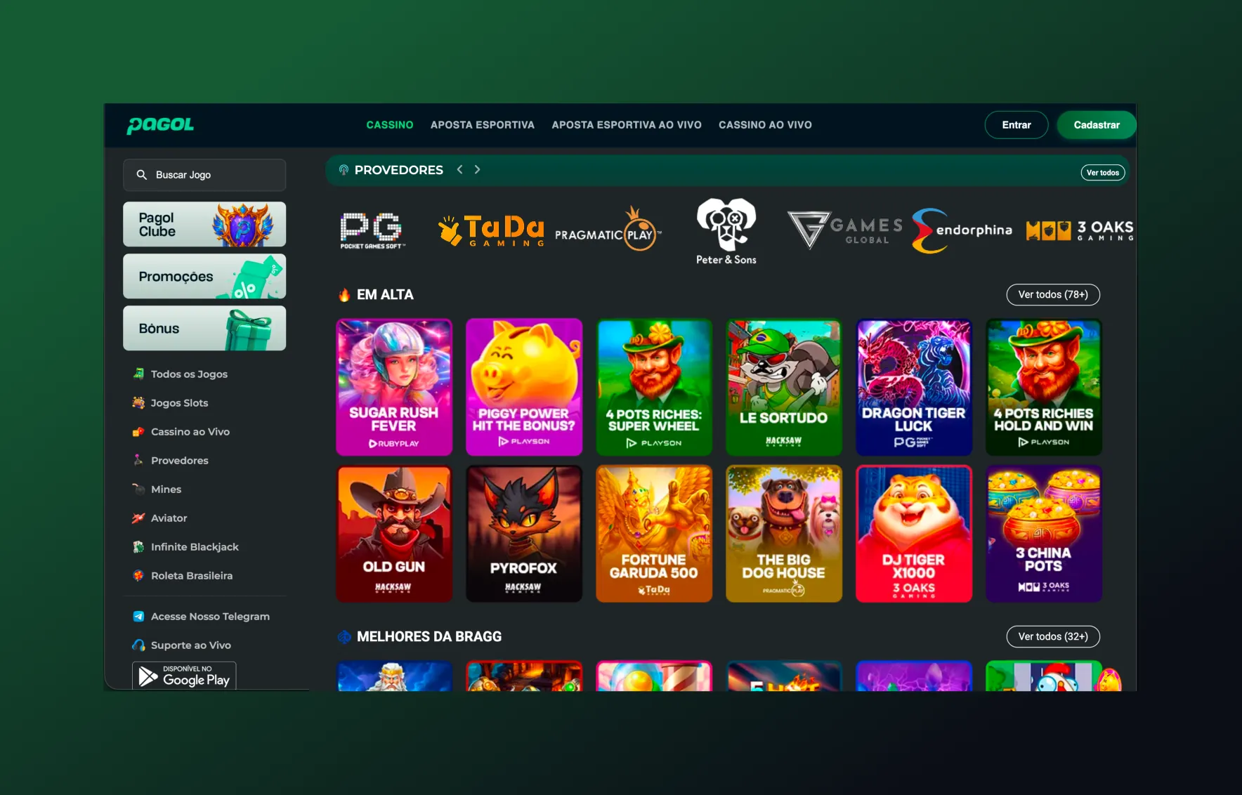
Pagol shares the 4Play design system but has its own identity and audience. I adapted the components to the brand, moved sports to a light theme, brought slots into the sports page and redesigned the navigation.
1design system shared with 4Play
2themes: dark and light
3breakpoints
- My role
- Product designer for the brand: research, behavior analysis, design and build follow-up.
- The problem
- Pagol needed its own look without forking the system, and a sports page that also led players to the casino.
- What I did
- Shared components with brand tokens, a light theme for sports, a slots strip inside the sports page, a new navigation bar with the club one tap away, and the same location flow as 4Play.
- Result
- Shipped on Pagol (2025–26) through the same improvement loop used on 4Play: behavior data, A/B tests and KPI review.
- A decision I'd defend
- One system, two brands. Instead of copying screens, every difference became a token or a variant, so a fix made for one brand reaches the other at no extra cost.
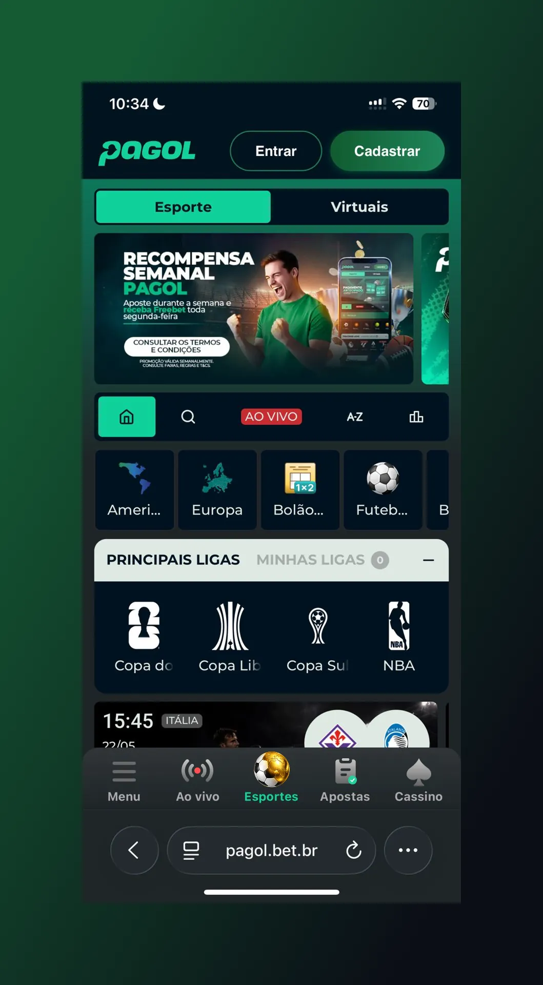
Sports in the light theme
Sports in a light theme, with slots placed where sports players already look.
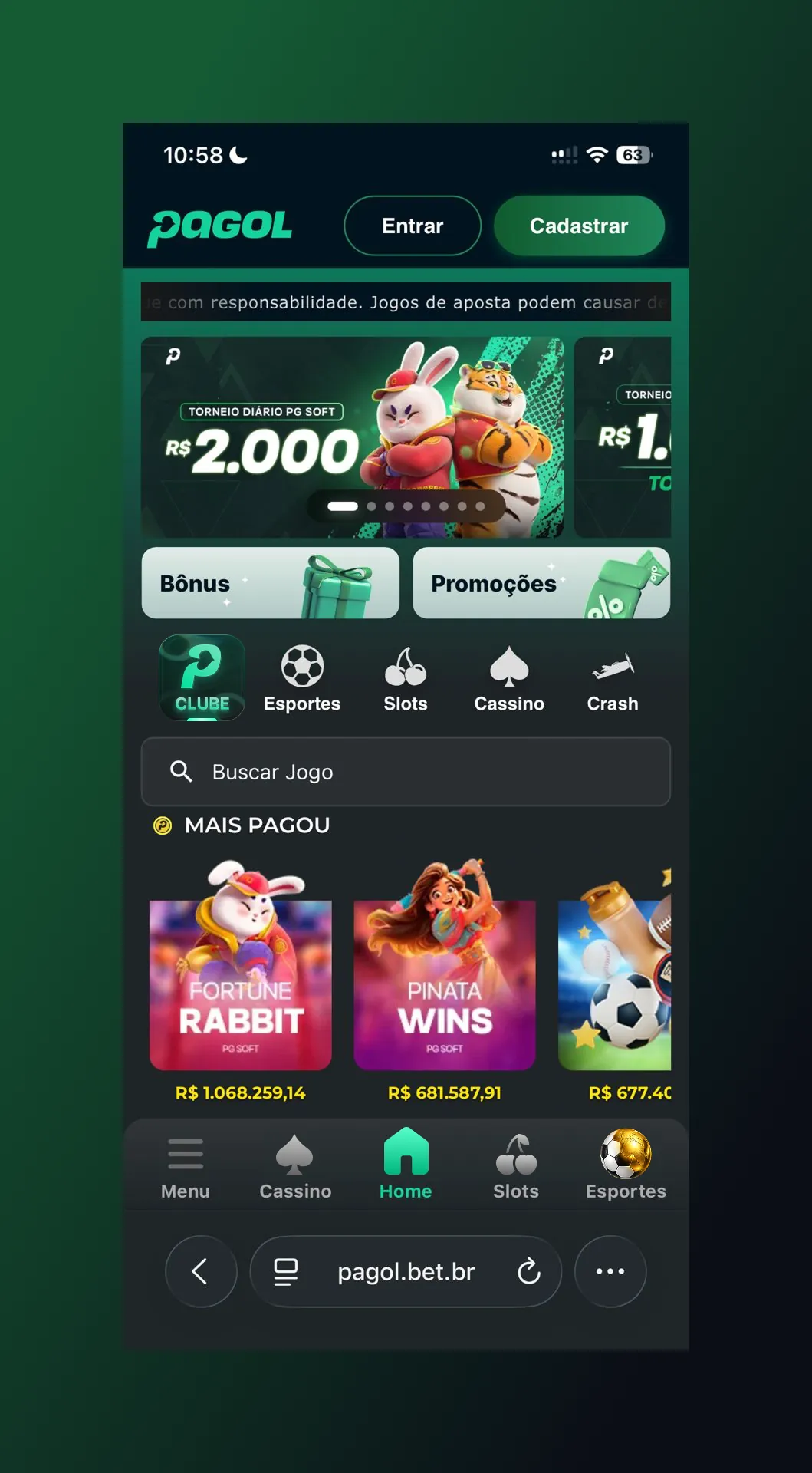
Navigation and club
A new bottom bar with casino, sports and the club always one tap away.
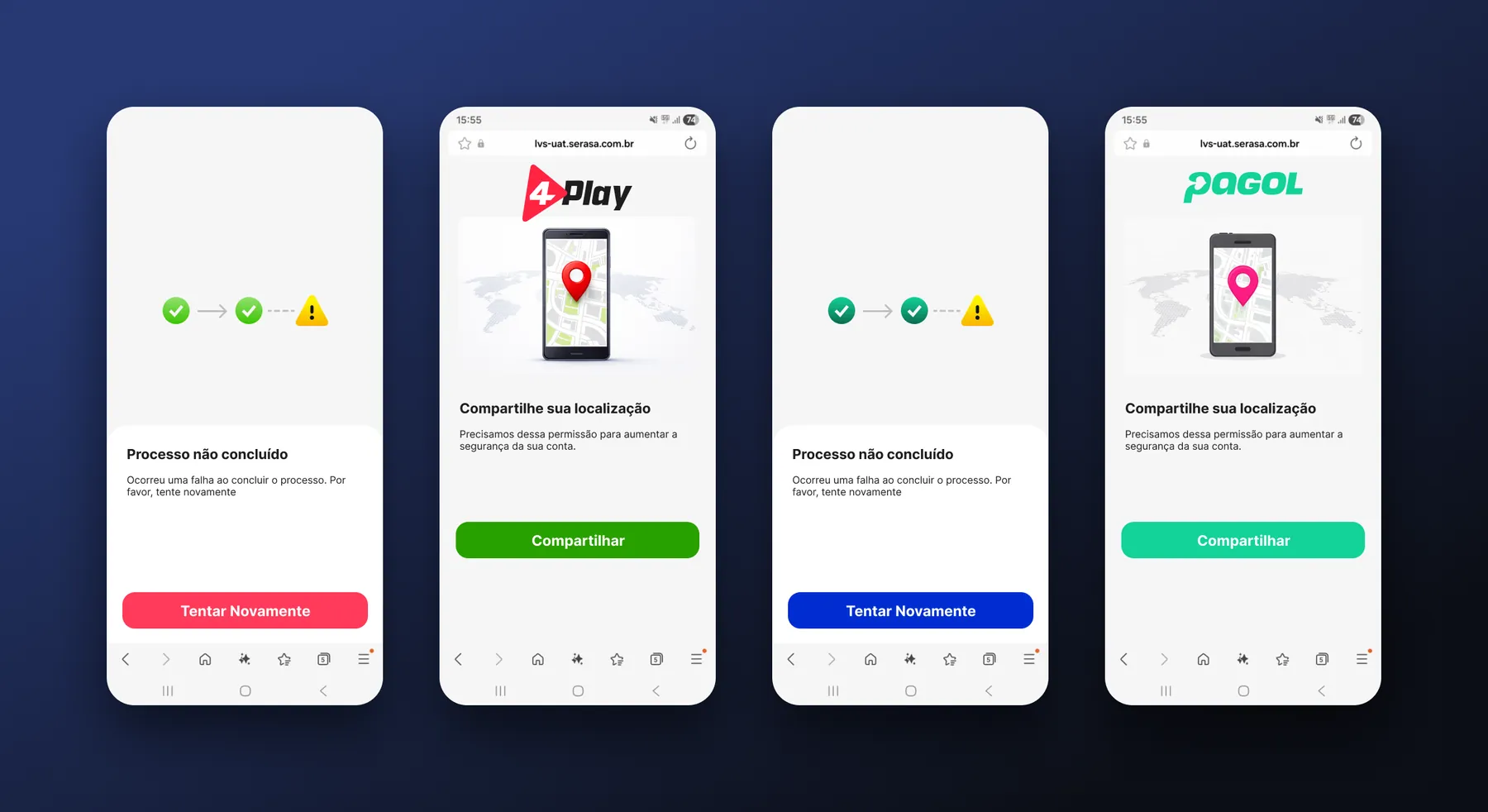
Location check
The same permission and error flow as 4Play, in Pagol's identity.
Some of the screens shown here may have changed since Brazil's betting regulation took effect. The screens come from my own design files. This page shows interface design only and is intended for adults (18+).
Sign-up or onboarding losing people? Start with a Flow Audit.
Ask for a Flow Audit