Orra Ring
Orra is a smart ring I made up to plan a launch from start to finish: who it's for, what the page has to answer, how the 3D story moves, and how each click becomes a CRM signal that keeps the conversation going after the visit.
Summary
A launch page for a sleep ring, planned end to end: audience, journey, 3D scroll story, a 2-question quiz and the CRM behind it.
- My role
- All of it: concept, UX planning, copy, visual and motion design, the 3D ring in three.js, front-end and the CRM event plan.
- The problem
- Wearable pages usually list sensors and charts. People who want better sleep ask simpler things: will I notice it on my finger, does it help, what do I do first. The page had to answer that in seconds and still give the visitor a reason to come back before launch.
- What I did
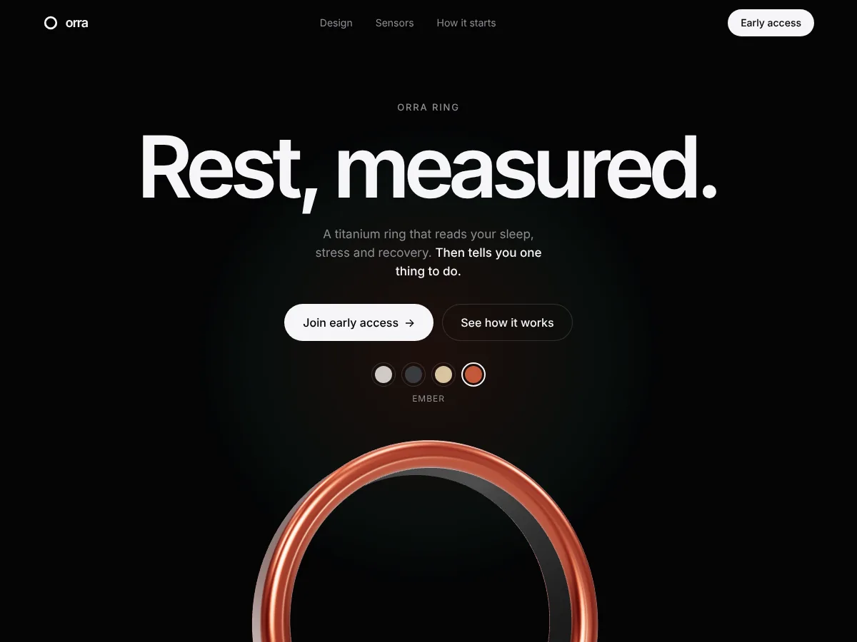
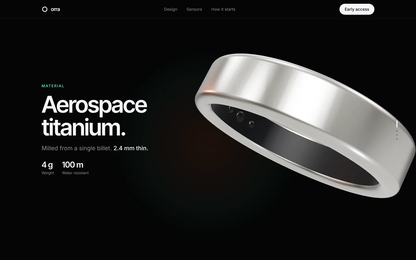
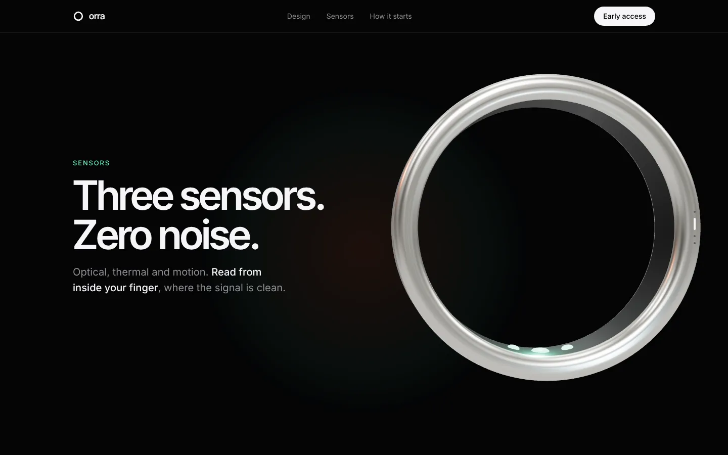
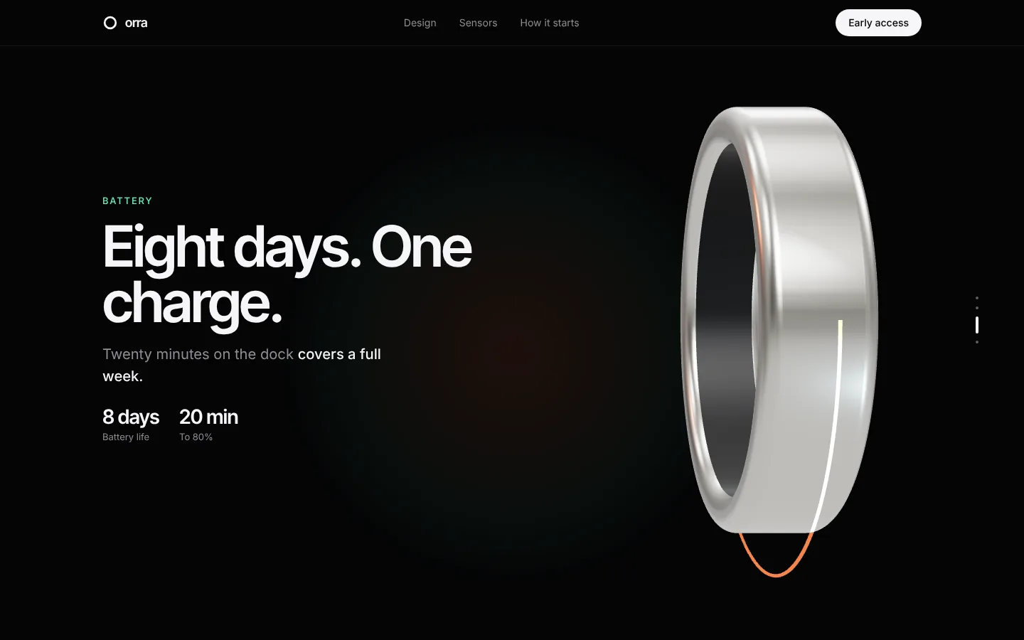
- One promise, “Rest, measured”, told in eight sections that follow the visitor's questions in order. The 3D ring carries the story while you scroll: material, sensors, battery, finish. Instead of a plain waitlist, a 2-question quiz builds a personal plan, so signing up feels like getting something right away.
- A decision I'd defend
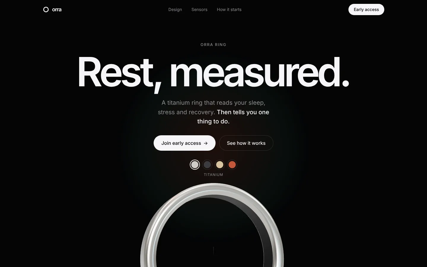
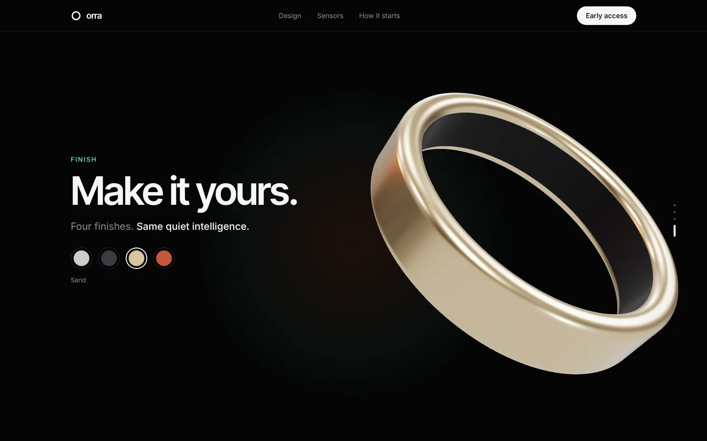
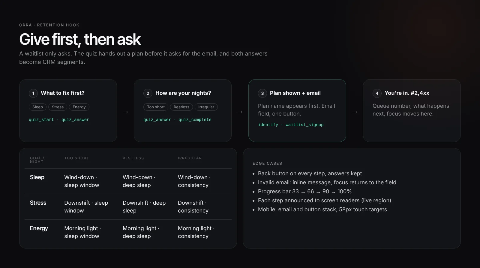
- I swapped the classic waitlist form for a quiz. A waitlist only asks; the quiz gives a plan first and asks for the email after, and the two answers become segments the CRM can use from the first email. I also put the finish picker in the hero, above the ring, because choosing a colour is the cheapest way to make a product feel like yours.
- Result
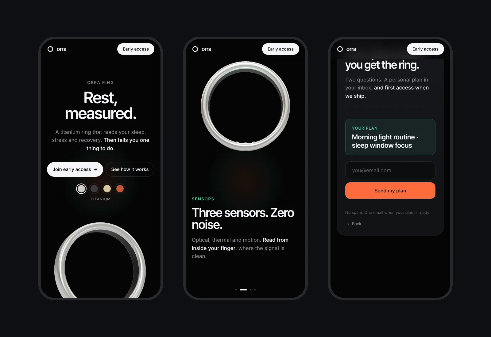
- A live concept page with a procedural 3D ring, a scroll-linked story, a finish picker, onboarding steps and the quiz, plus an event layer ready for HubSpot, Braze or a gamified CRM. It works on mobile, respects reduced motion and falls back cleanly on weak devices.
How I worked
From promise to CRM, in the order I worked.
- PositioningOne product, one promise: “Rest, measured.” A ring that gives one clear nudge a day instead of another dashboard.
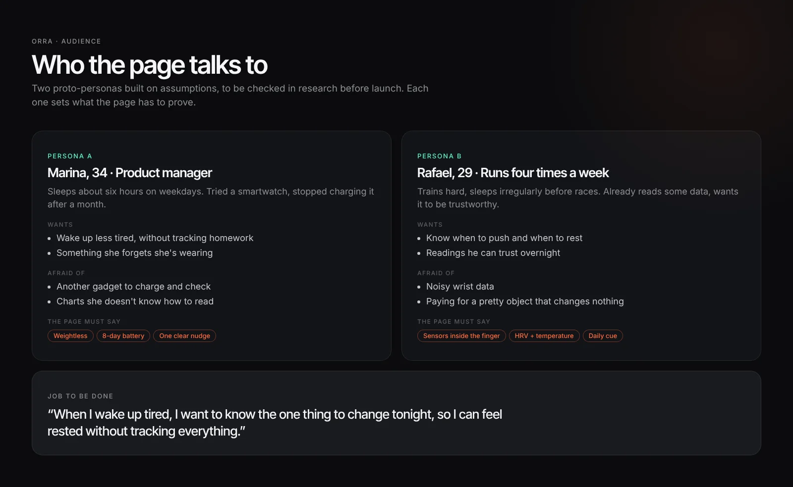
- AudienceTwo proto-personas built on assumptions: the tired professional who wants better sleep without tracking homework, and the runner who wants to know when to push and when to rest.
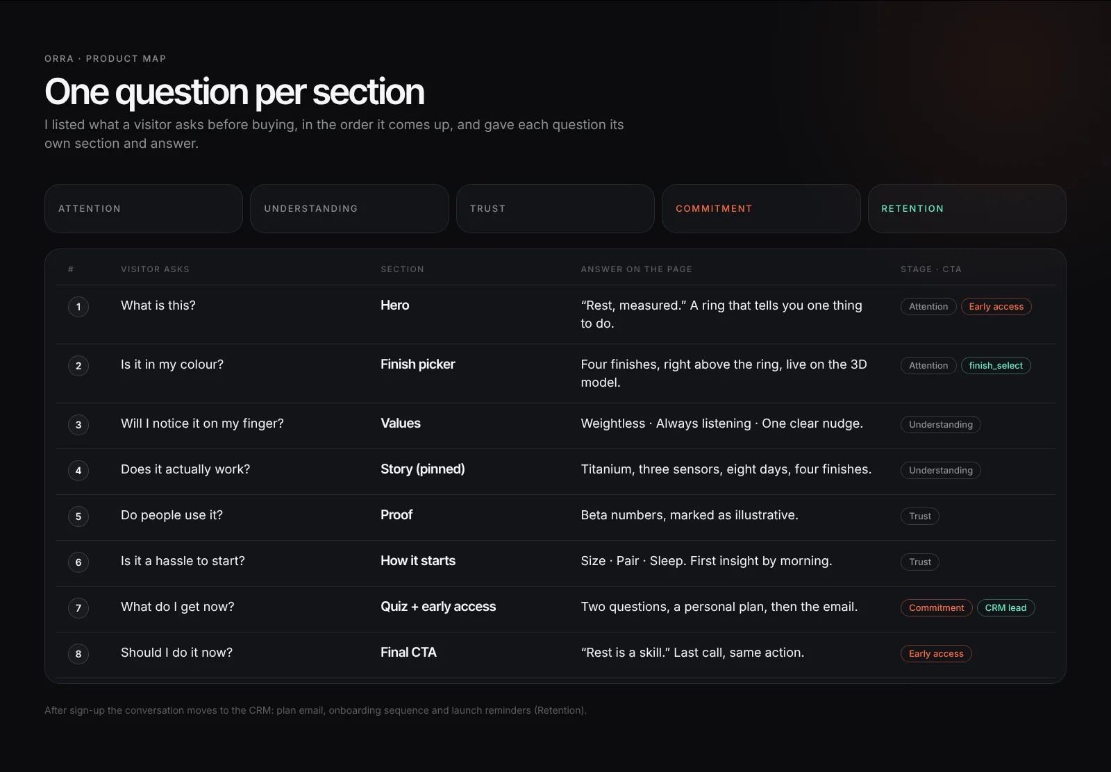
- Questions into sectionsI listed what a visitor asks before buying and gave each question its own section, in the order it comes up.
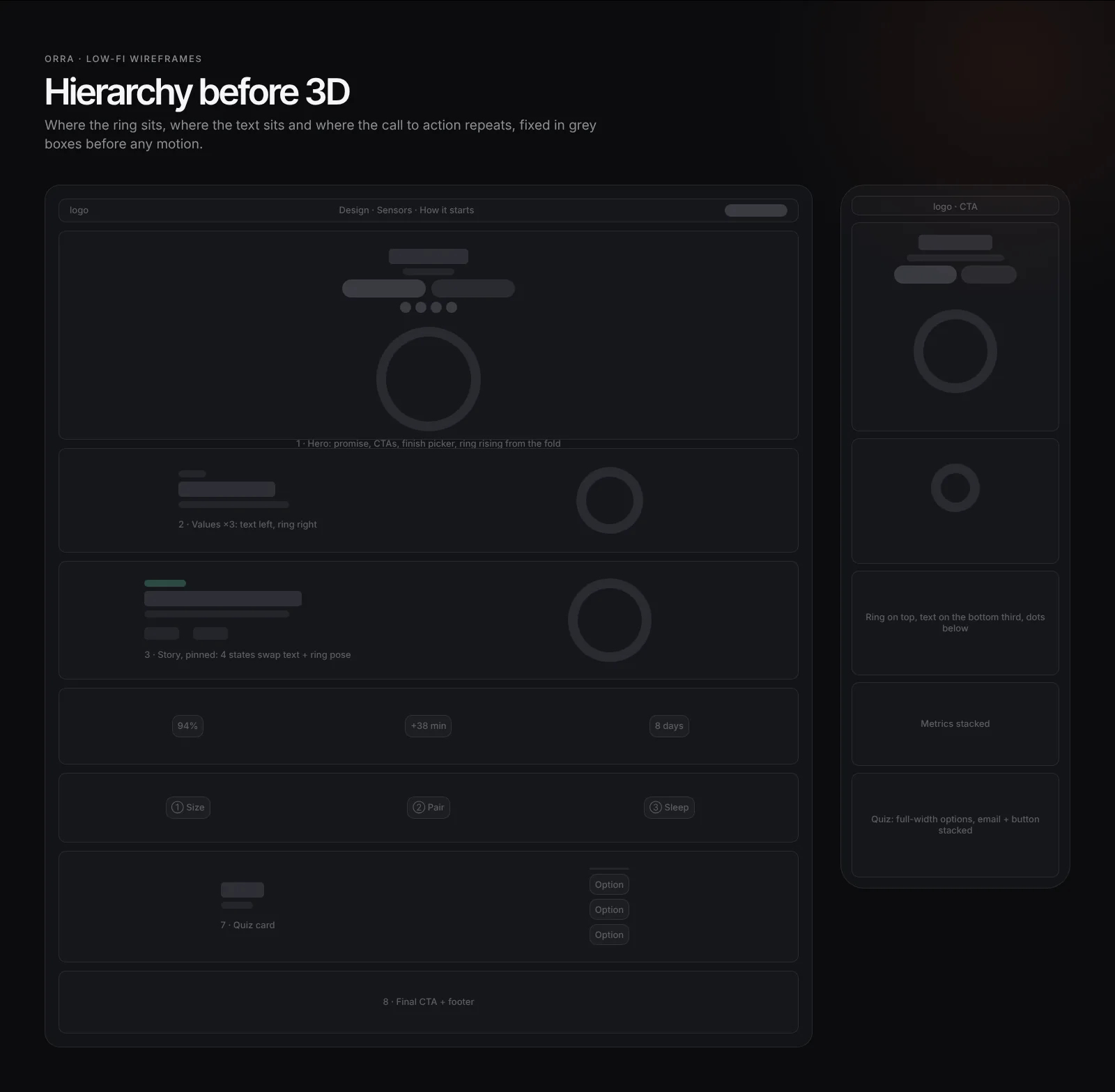
- WireframesLow-fi layouts for desktop and mobile to set the hierarchy before any 3D: where the ring sits, where the text sits, where the CTA repeats.
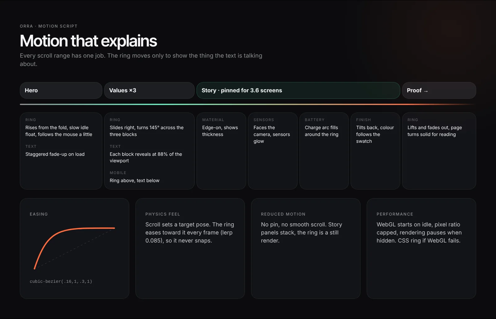
- Motion scriptA scroll timeline that says what the ring does in each section, so the motion explains the product instead of decorating it.
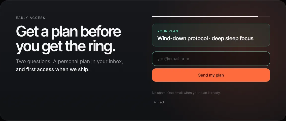
- Retention hookA 2-question quiz that hands out a plan, then asks for the email. Both answers become CRM segments.
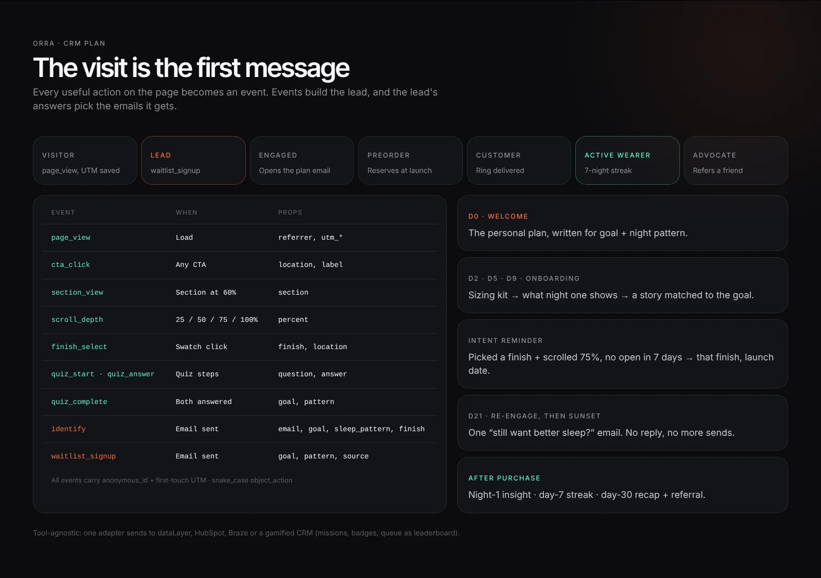
- CRM planEvent names, lead fields, lifecycle stages and the emails each segment gets after sign-up.
- Build and polishthree.js, GSAP and Lenis in one file. Performance limits, a reduced-motion version and a fallback when WebGL is missing.
The page
The hero opens with the promise and the finish picker. The story section pins and the ring changes pose as each claim comes up.
Who it's for
Two proto-personas built on assumptions, each one setting what the page must prove. They would be checked in research before a real launch.
One question per section
The page order follows the order of the visitor's doubts, from “what is this?” to “should I do it now?”.
Wireframes and motion
Hierarchy first in grey boxes, then a motion script that gives every scroll range one job.
 View full page ↗
Retention hook
Give first, then ask: the quiz hands out a plan before the email field appears.
Design tokens
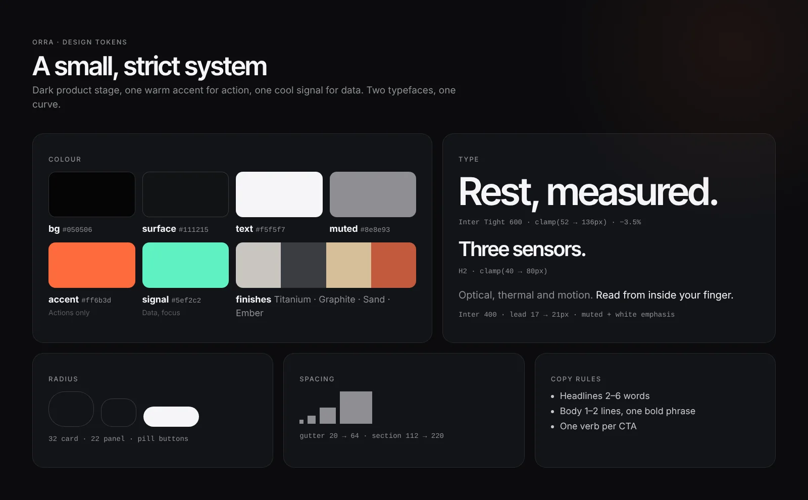
A dark product stage, one warm colour for actions and one cool colour for data.
CRM plan
The visit is the first message. Events build the lead, and the quiz answers decide which emails it gets.
Next case: Tinker